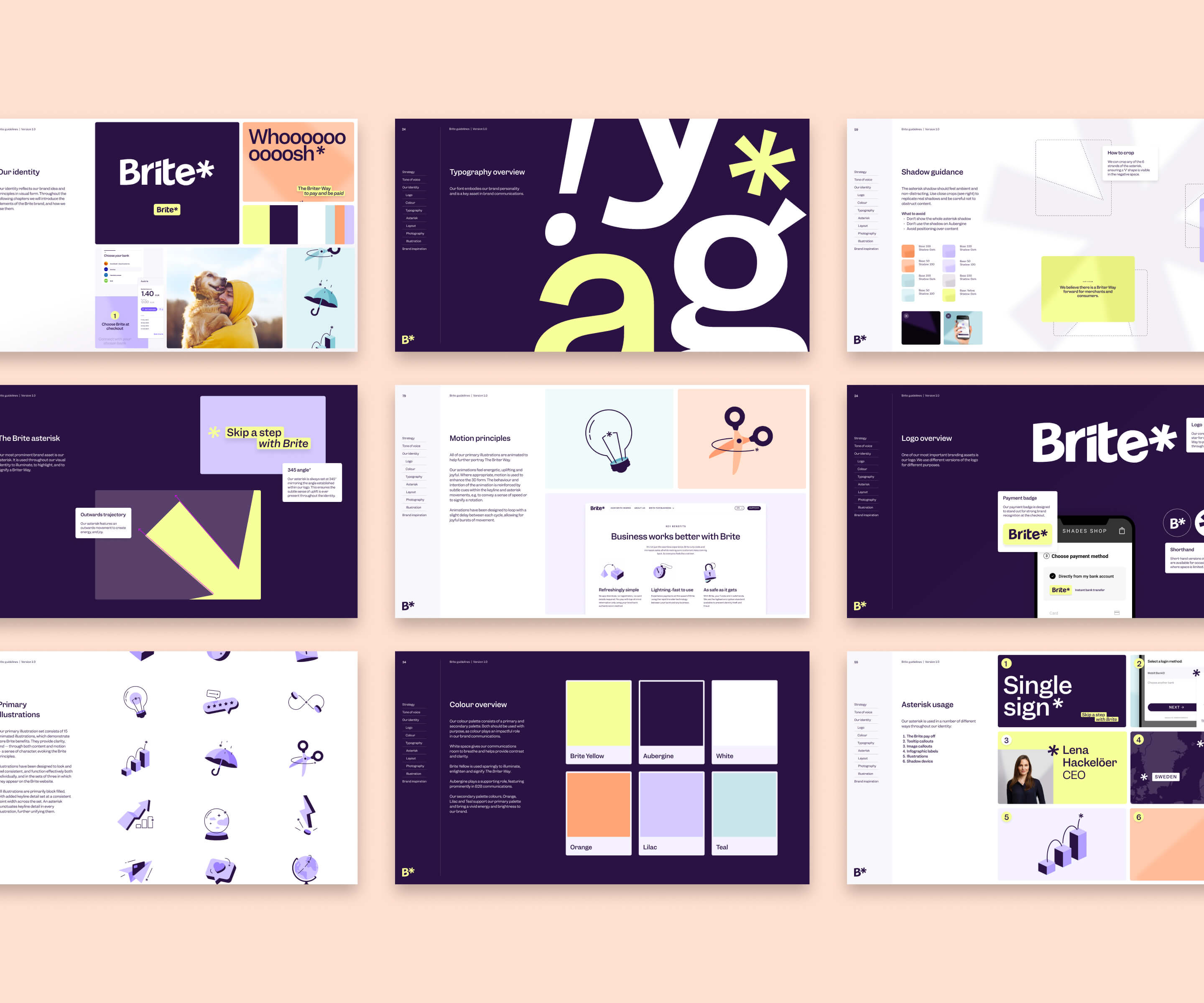
Briter payments for everyone
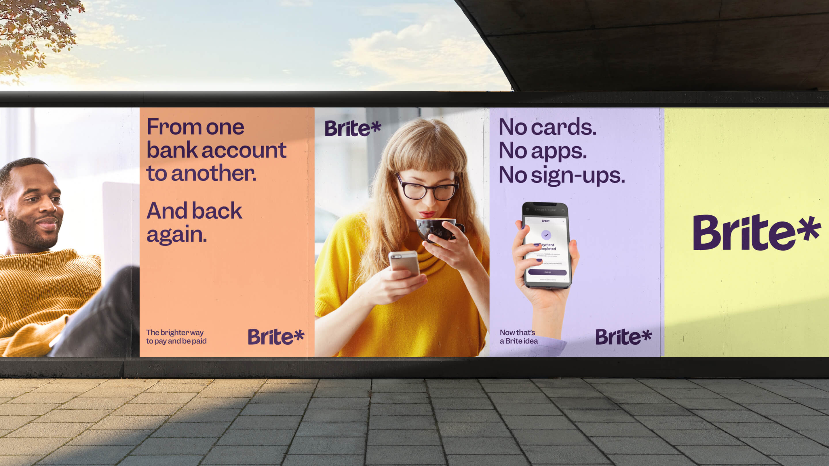
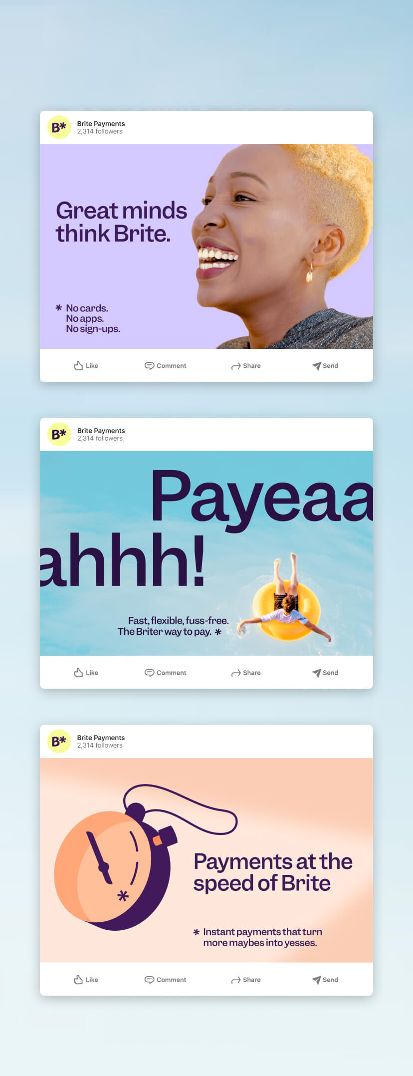
The world of payments is stuck in the dark ages: opaque, complex, and slow. Brite is the antidote. A next generation instant payment provider, built for the digital age. It lets businesses and consumers in Europe use their bank accounts to pay in seconds. No apps, cards, or sign-ups.
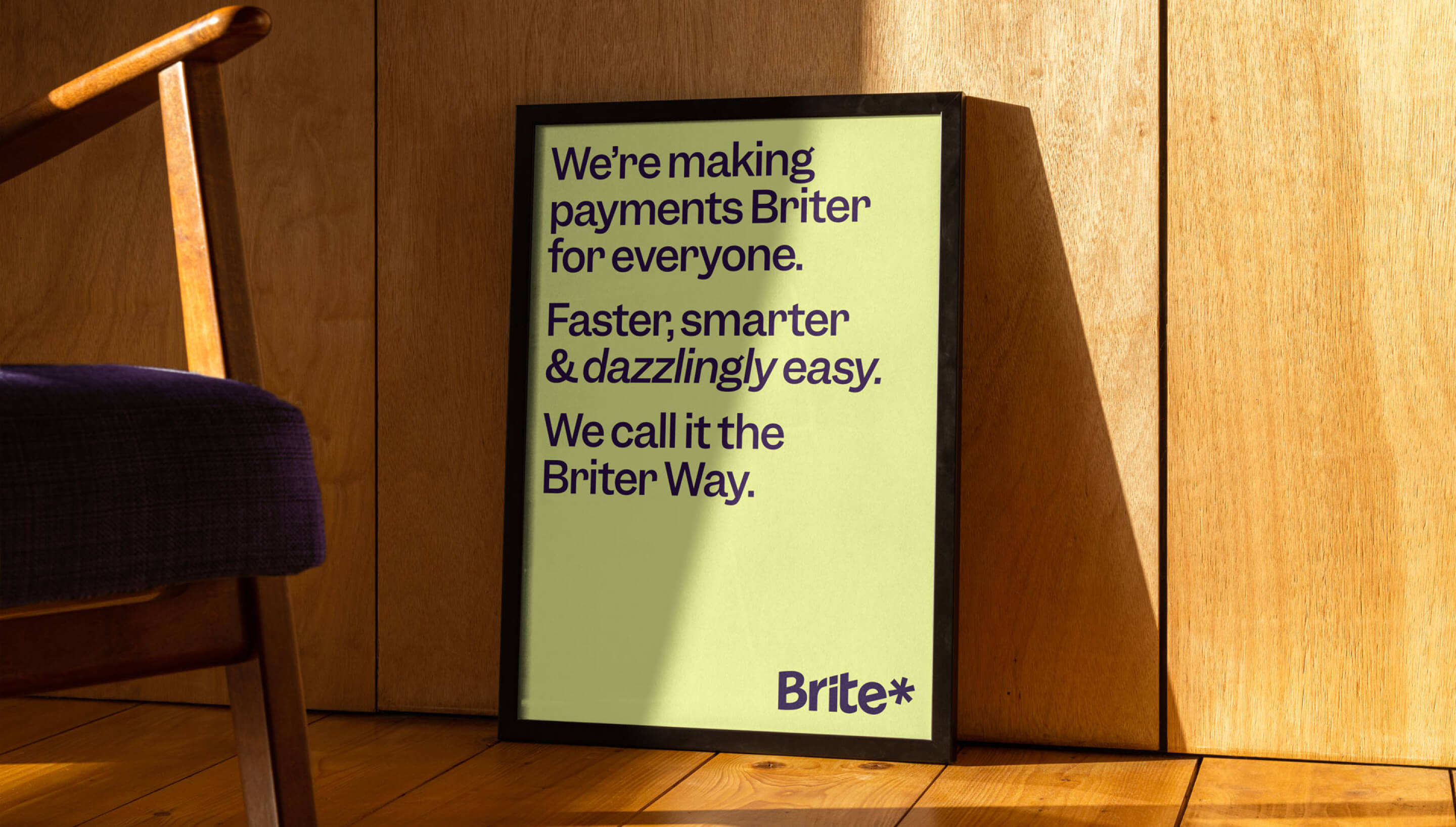
Paying with Brite is faster, smarter, and dazzlingly easy. We captured this philosophy in a simple brand idea: “The Briter Way”. A shorthand for what’s brilliant about Brite, building from its evocative brand name.
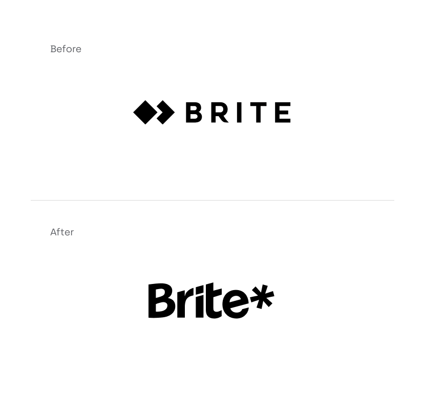
An altogether Briter identity
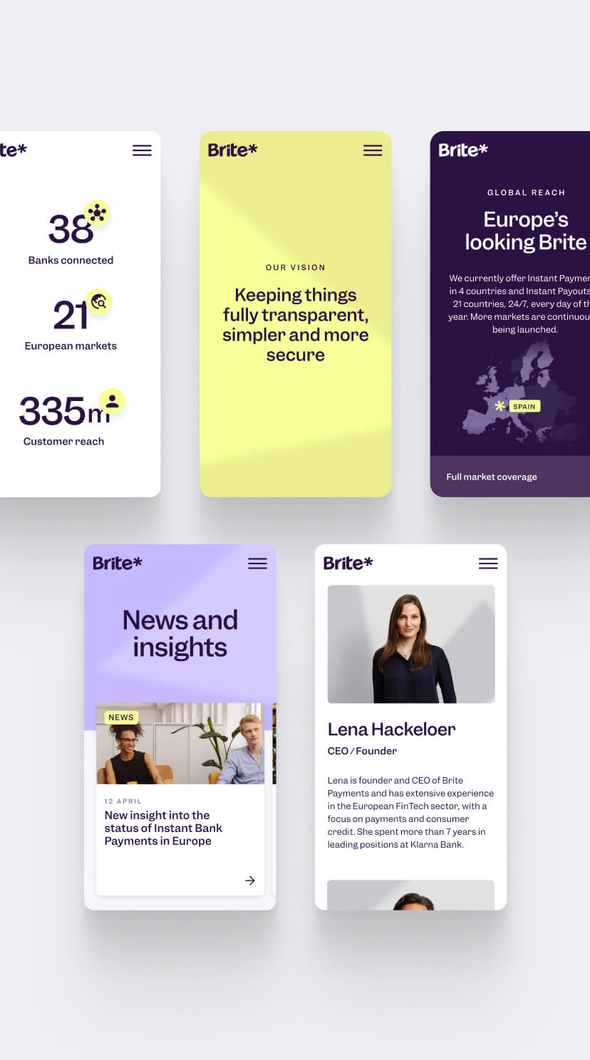
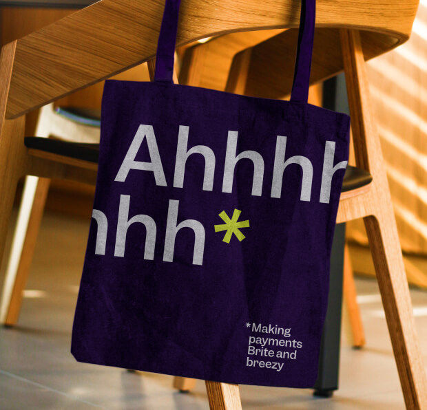
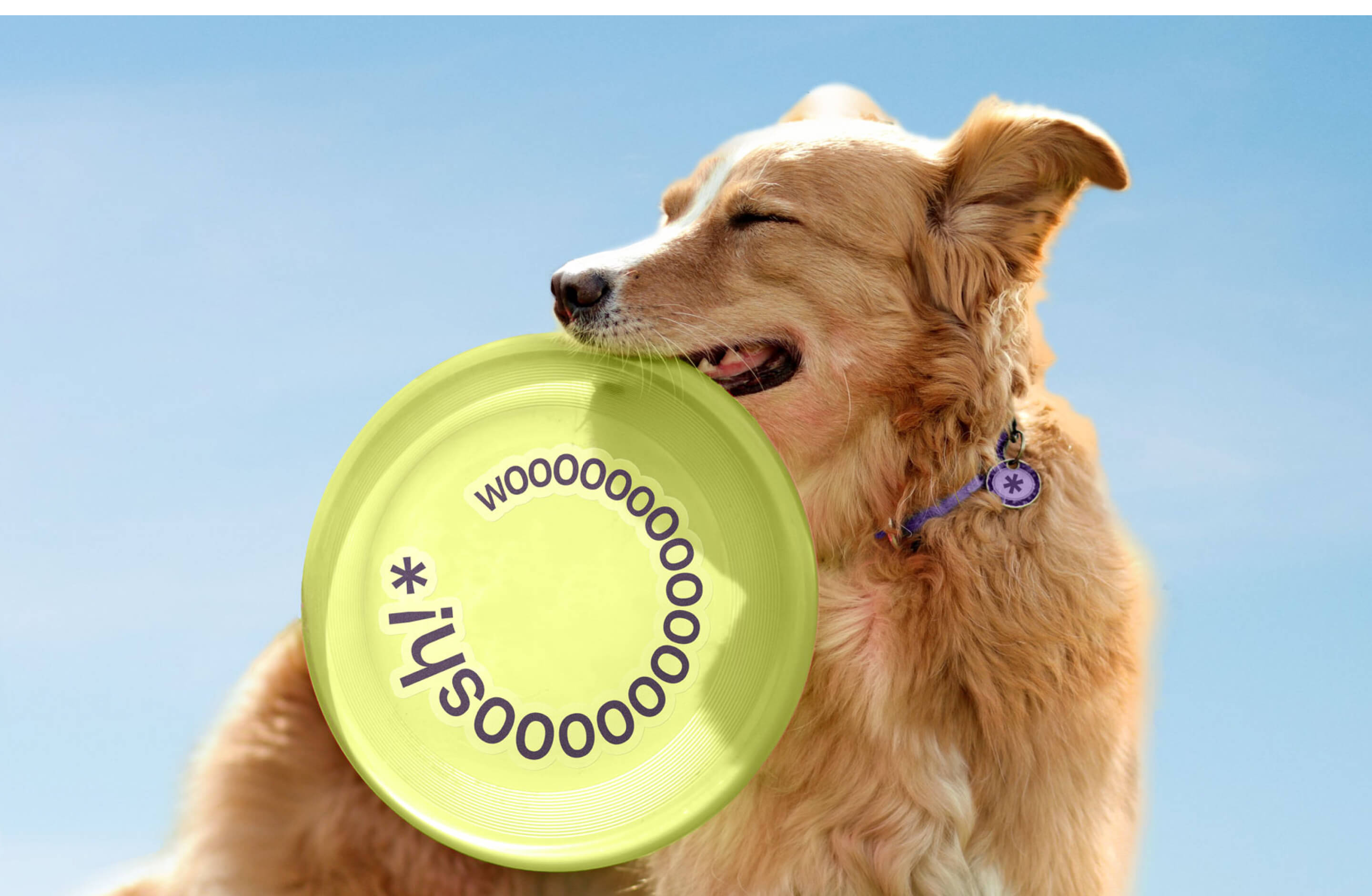
The Briter Way comes to life across the brand toolkit. Suggestive of a beacon of light, an asterisk is the brand’s key graphic motif. It provides helpful detail, or symbolises a point of activation across the identity. An optimistic, witty brand voice riffs off the name to create ownable messaging. While illustrations add charm to interactions and messages, elevating the Brite experience.
Briter moments
Delightful micro interactions and playful moments feature across Brite’s digital touchpoints. All helping to reinforce The Briter Way, without getting in the way of the experience.
Brite down to the smallest detail
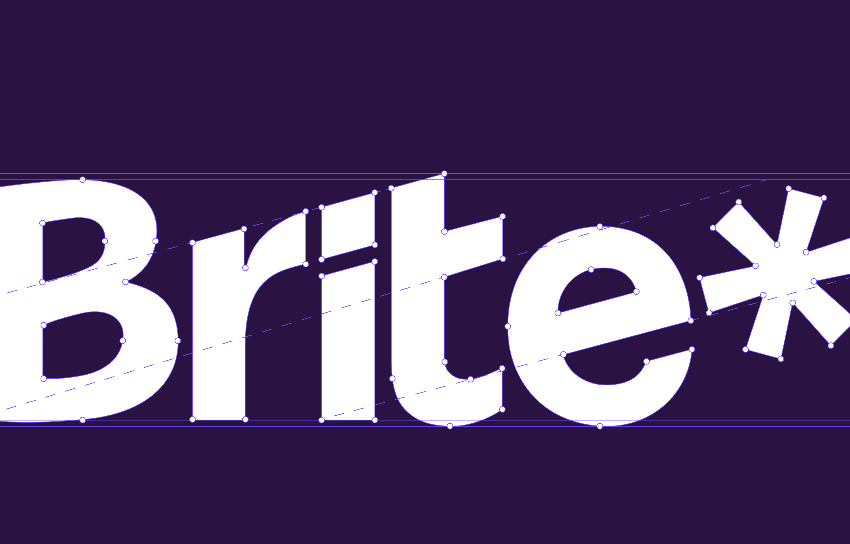
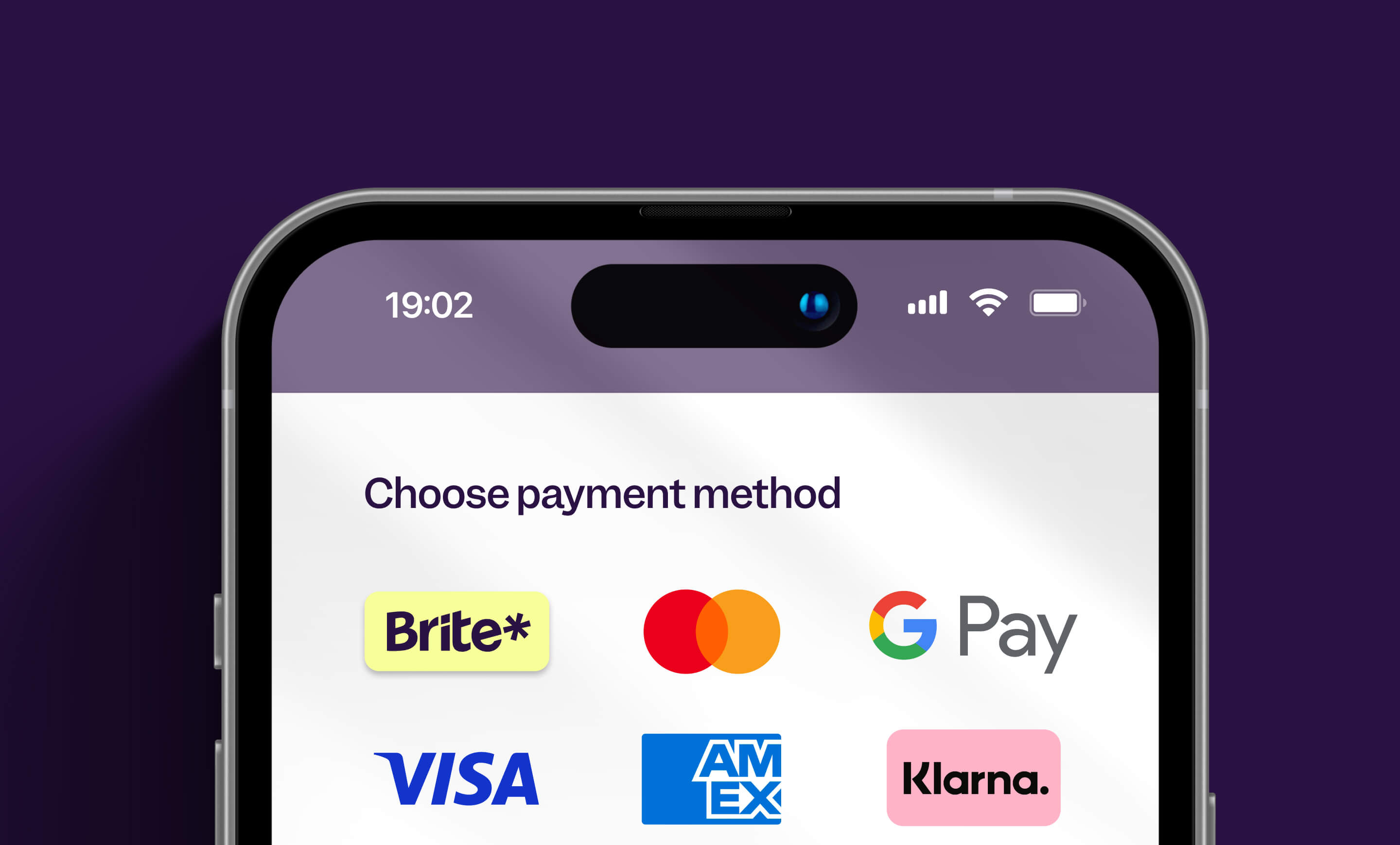
Most people meet Brite at an e-commerce checkout: a tiny space on screen among an array of other payment providers. So to stand out and stand up, we crafted the logo to be a distinctive piece of typography and robust at small sizes.
“We needed a partner who understood B2C and B2B equally well and to help us put a fresh spin on the world of payments. MultiAdaptor delivered, and we found them easy, fun, and responsive to work with. I would recommend them to anyone looking to do a brand overhaul.”
Lena Hackelöer, Founder and CEO
Thank you
Special thanks to Lena and all at Brite for the collaboration. Thanks also to Smithfield Studio for the site build.