A brand for a better way to find commercial workspaces
Founded in 2001, Officio is a commercial property consultancy operating across the UK.
With a diverse and long-standing client-base encompassing everything from global brands to fast-growing startups, they specialise in finding flexible workspaces that are a perfect fit, without any fuss.
And in the post-Covid world of work, it’s an approach that is more important than ever.


Brand challenge
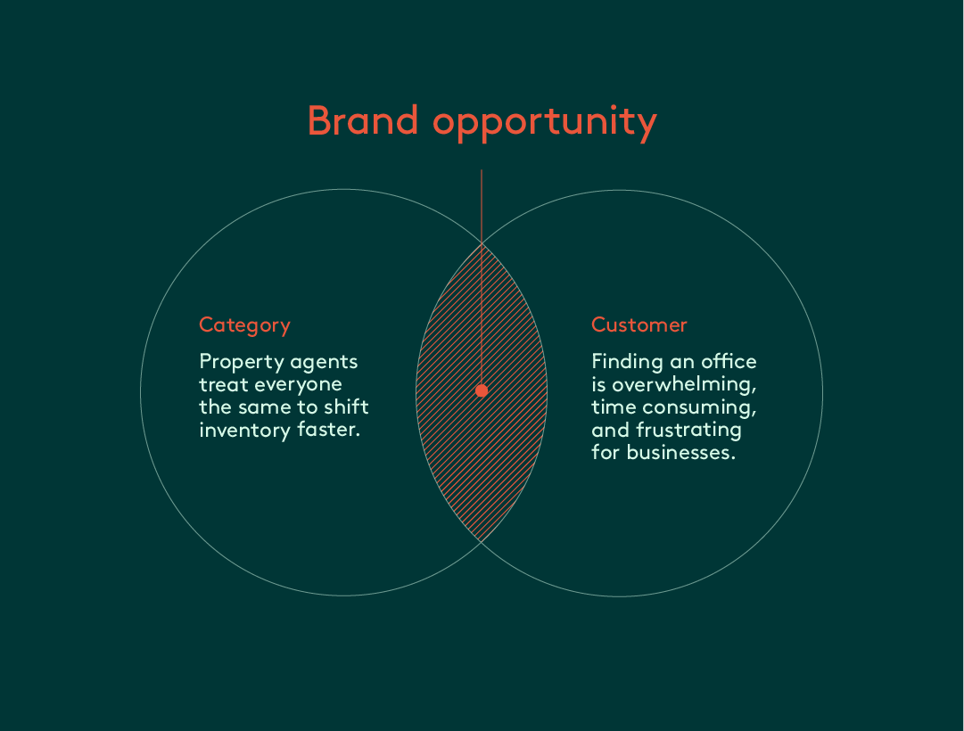
Formerly known as Officebroker, Officio’s previous name and brand communicated very little about what made them special and why their loyal clients loved working with them so much. Potential clients had no idea what to expect until they experienced it first-hand and felt the benefits of the service.
The brand was letting them down when they weren’t there in person. So we partnered with them to help change that.
MultiAdaptor immediately got us and our brand challenge. Our new name and brand not only truly reflects us, it has completely transformed how we are perceived.
Brand idea
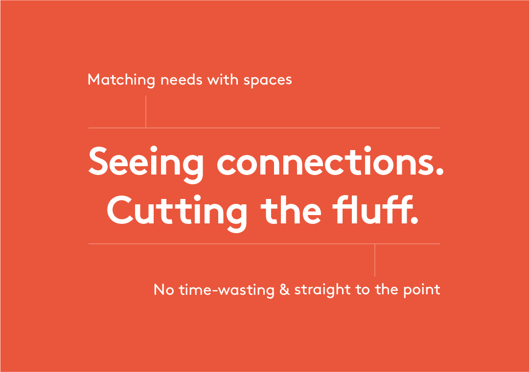
Officio is the antithesis to lazy, robotic, one-size-fits all, office searches. By matching the needs of businesses, with genuinely relevant spaces, they only ever show property worthy of their clients’ valuable time. So all the typical noise and hassle is stripped away in the process.
We translated the essence of this insight into a simple idea, to propel the brand forward: ‘Seeing connections. Cutting the fluff.’

Brand personality
Officio are a group of extremely knowledgeable, highly personable experts, who get the job done, without the nonsense. The brand’s personality is designed to capture exactly this: assertive, honest, and to the point, but relatable, upbeat, and down-to-earth.
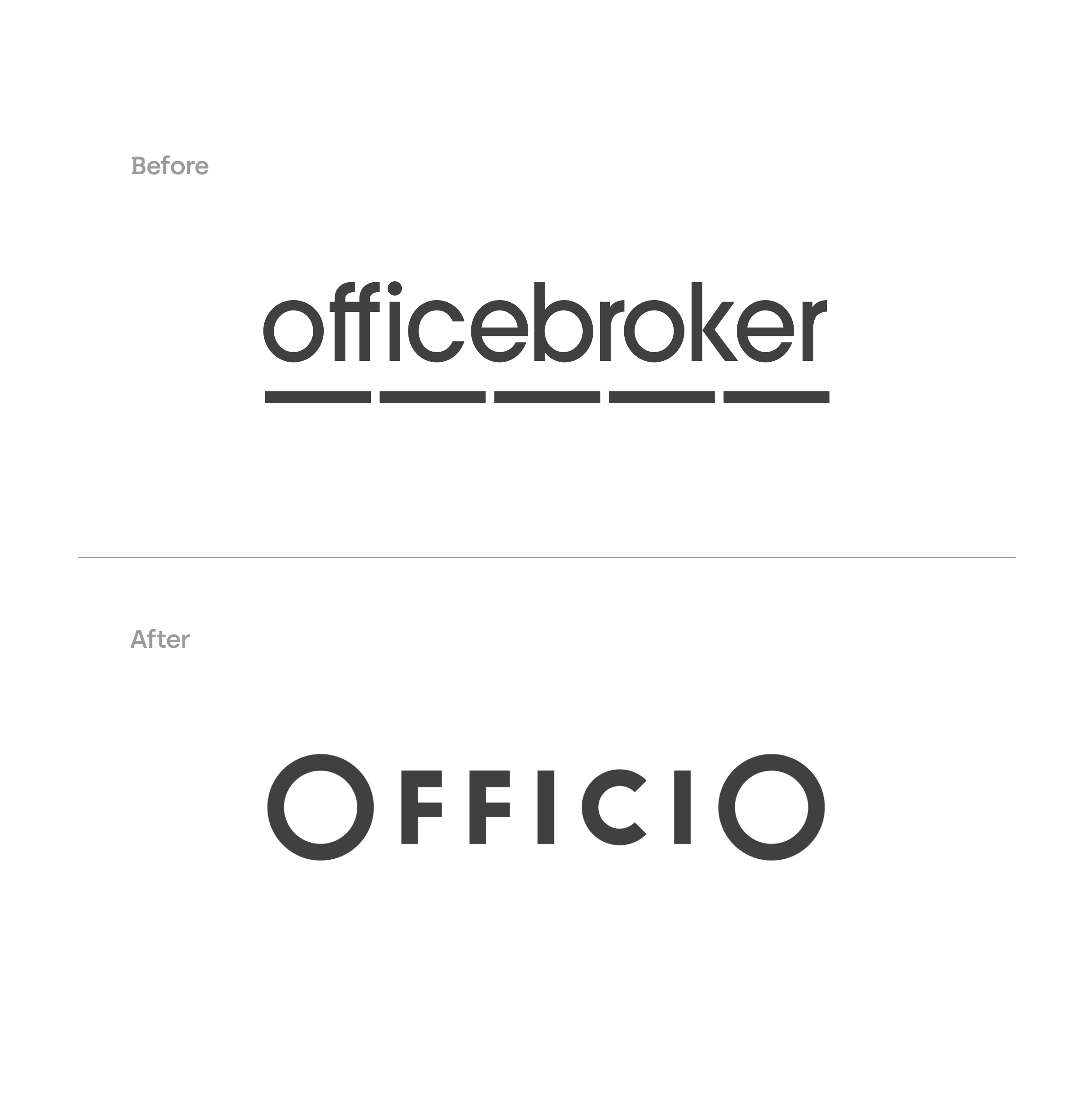
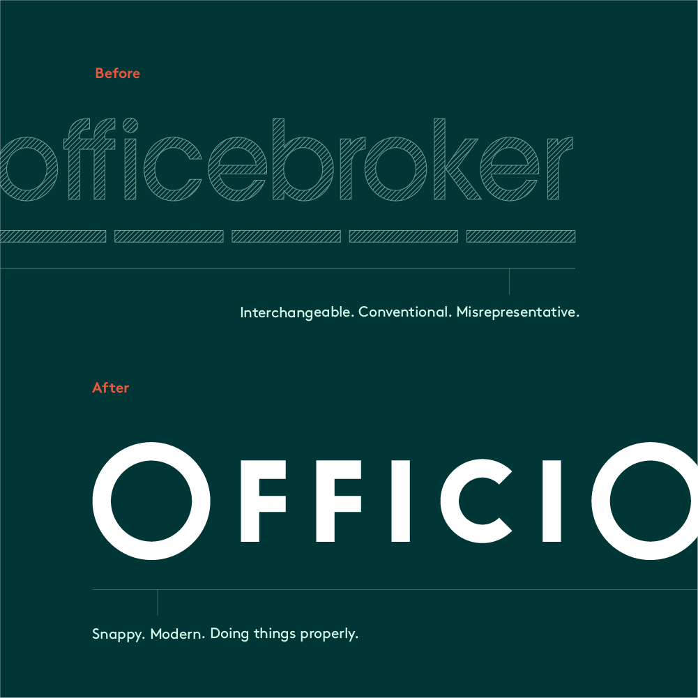
Officebroker becomes Officio
Officebroker’s name was holding it back. Its functional nature suggested just another interchangeable intermediary, rather than high-quality, consultative specialist.
The new name, Officio, is a nod to the category while also conveying the idea of best-in-class. Its abstract quality feels modern and accessible, helping to reposition the business in the eyes of customers, and feel distinct from competitors.
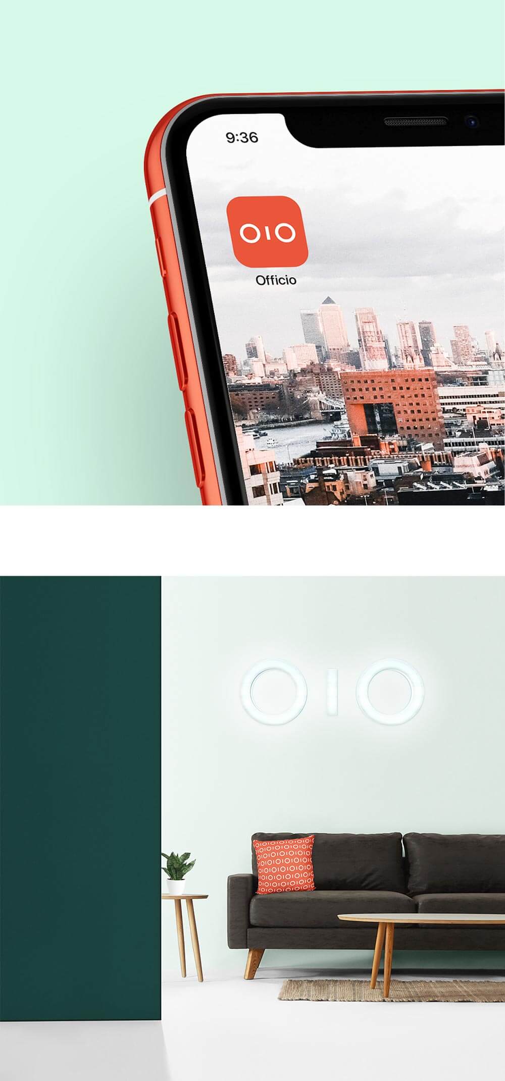
New name, new logo
At the centre of the identity is a new logo which feels simple, iconic, modern and authoritative. In an ownable twist, the two ‘O’s in the wordmark can also collapse into a distinctive symbol evocative of binoculars, reinforcing how Officio sees connections between businesses and spaces.
A powerfully simple, highly distinctive identity
Officio’s identity is purposefully bold, simple, and sophisticated, underpinned by a distinctive tone of voice. Altogether it helps to convey the quality of Officio’s service and allows their unique character to cut through.
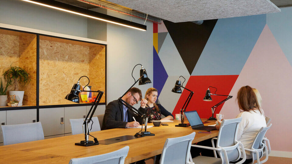
A focused, but flexible colour palette enables the brand to take on different modes: balancing expert and upbeat, with calmness and clarity. Typography is unfussy and direct, echoing Officio’s approach to business. While imagery showcases how workspaces are used by people — key to how Officio gets it right.


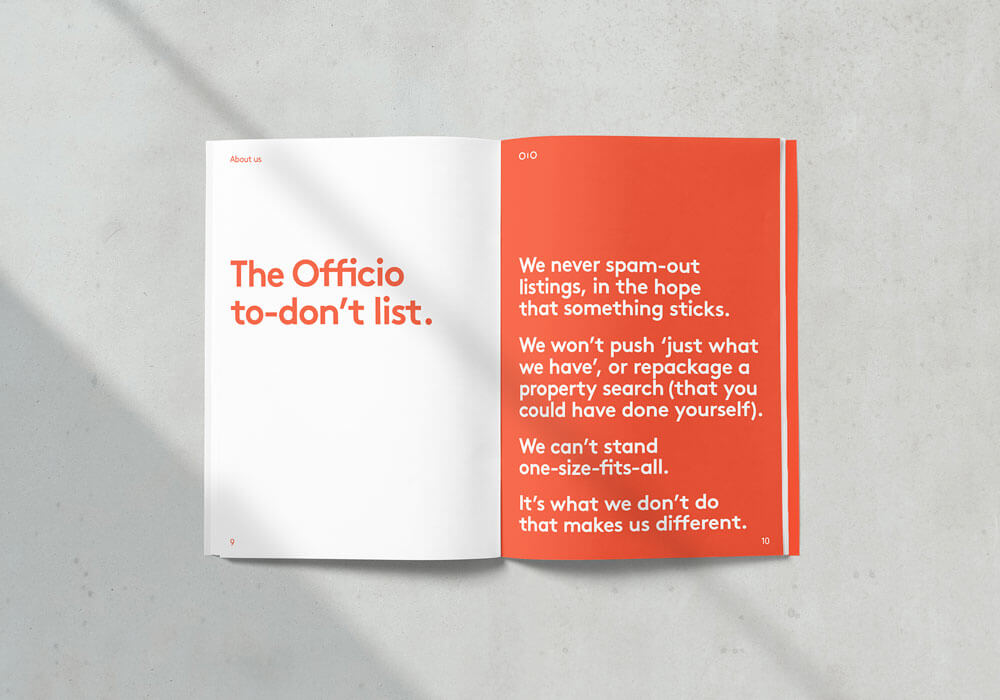
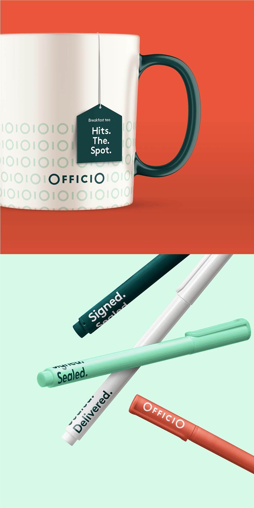
Tone of voice — recognisably Officio at every touchpoint
From sales tools, to marketing materials and client gifts, Offico’s ownable tone of voice runs through everything. It makes highly functional or usually jargon-filled applications more fun, and key moments of their customer experience more memorable.
Thank you
Special thanks to Chris, Jim, and Liz at Officio for their enthusiasm and decisiveness throughout the project.