Unleashing the power of individuality for better e‑commerce experiences
In a world of one-size-fits-all advertising, New York based Wunderkind enables brands to connect with people in more personalised ways. Its industry-leading marketing technology is measurably more effective too, and all without compromising customer privacy.

Brand challenge
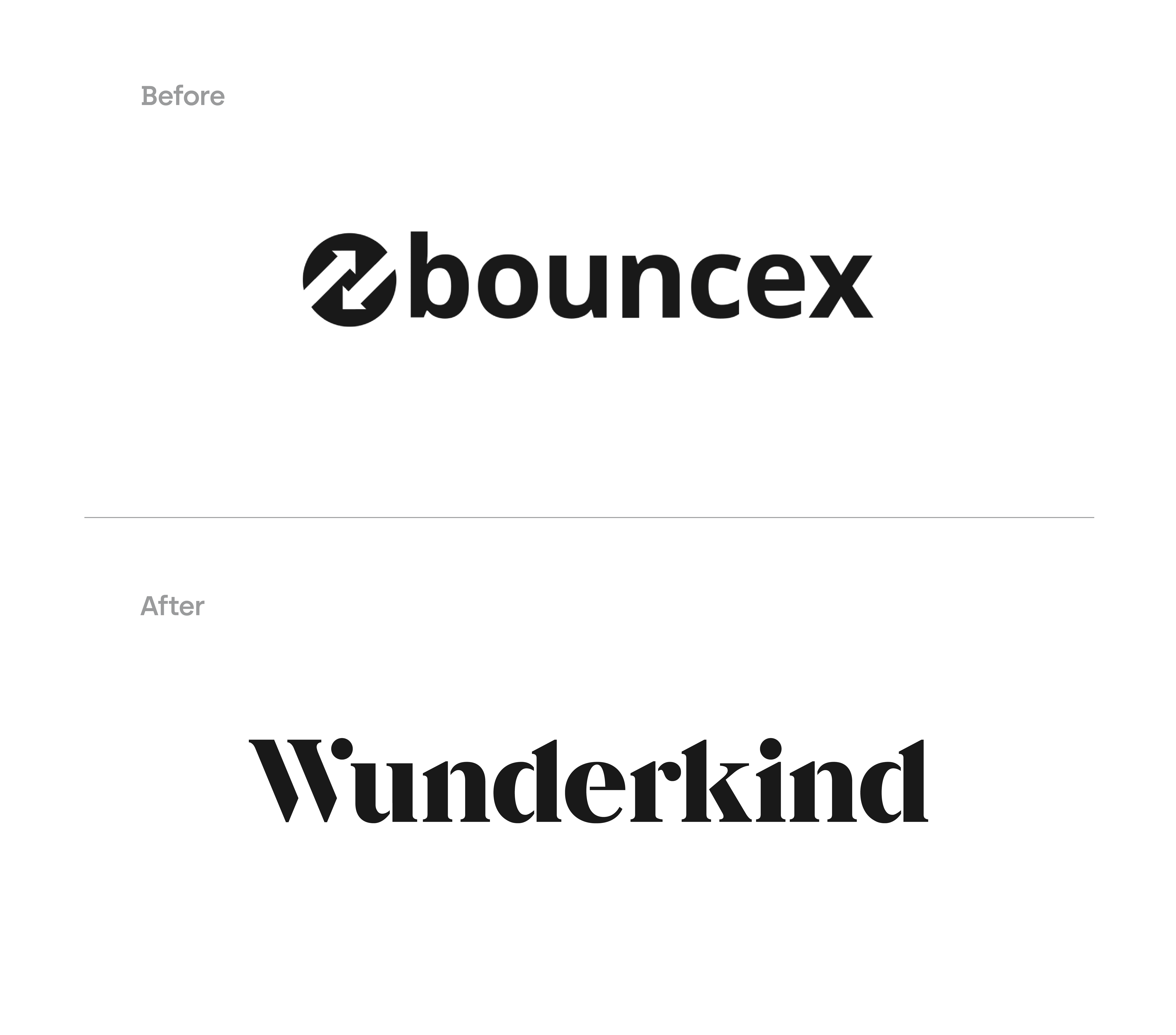
Formerly known as BounceX, the company had been recognised as the fastest-growing software firm in the US, and had hit annual revenues of $100m.
But Wunderkind had also outgrown its old identity, and a brave new brand was needed to match their bold new name.
MultiAdaptor are world-class. They were relentless in crystalising our challenge and what makes us special. We were blown away by their speed, craft, and depth of thinking.
Brand idea
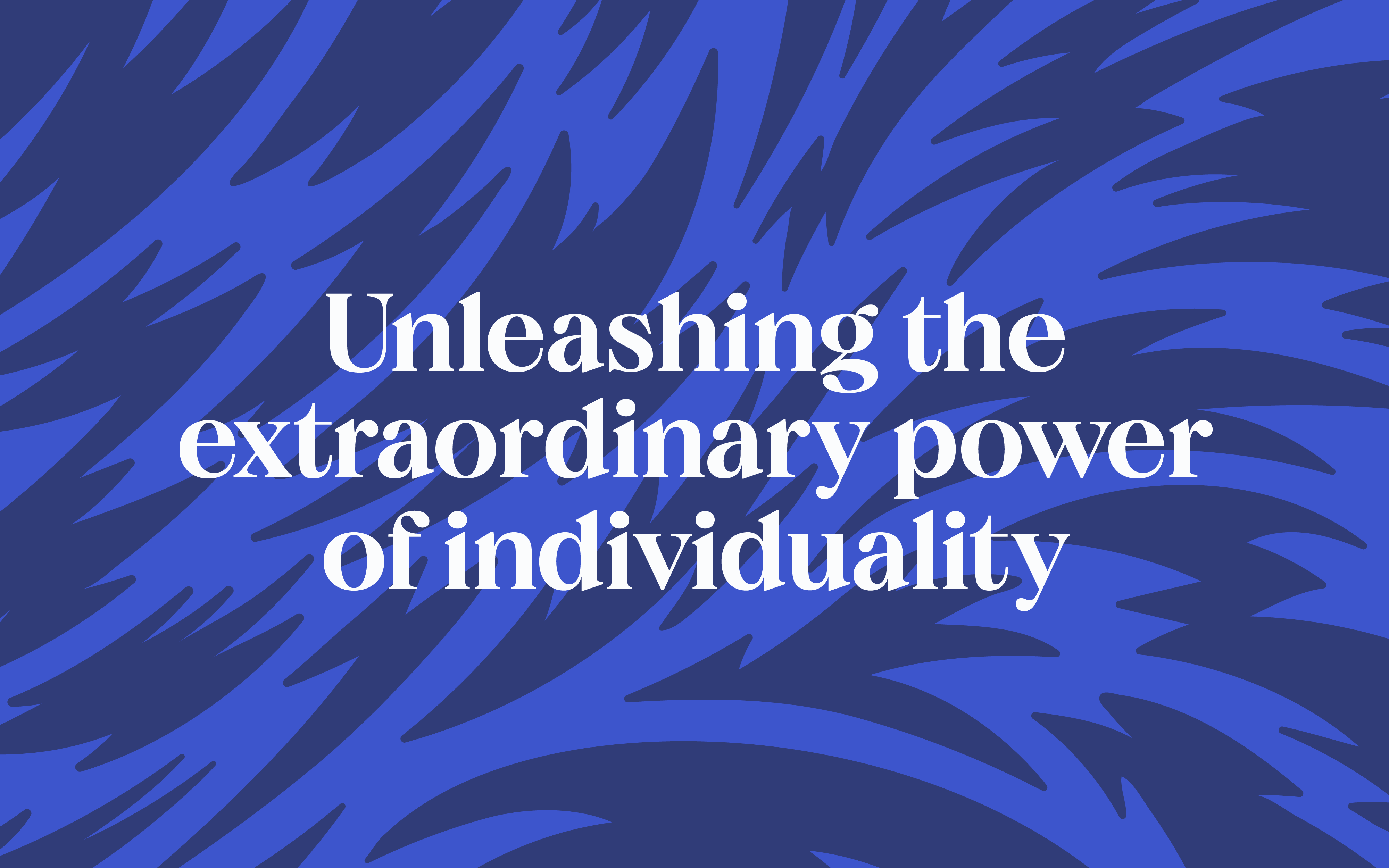
From their tailored client services and the personalised consumer experiences they create, to a belief that their people can be their best when they can be themselves, individuality unifies everything at Wunderkind.
So we put this idea at the heart of the brand, defining and inspiring everything they do.


Brand personality
Wunderkind has a truly unique personality. It sets them apart from the competition and connects with their clients on an emotional level.
Our aim with the brand personality was to balance this eclectic, energetic, and playful sense of fun, with a sophisticated confidence that reflects the premium positioning of their offer.

Brand identity
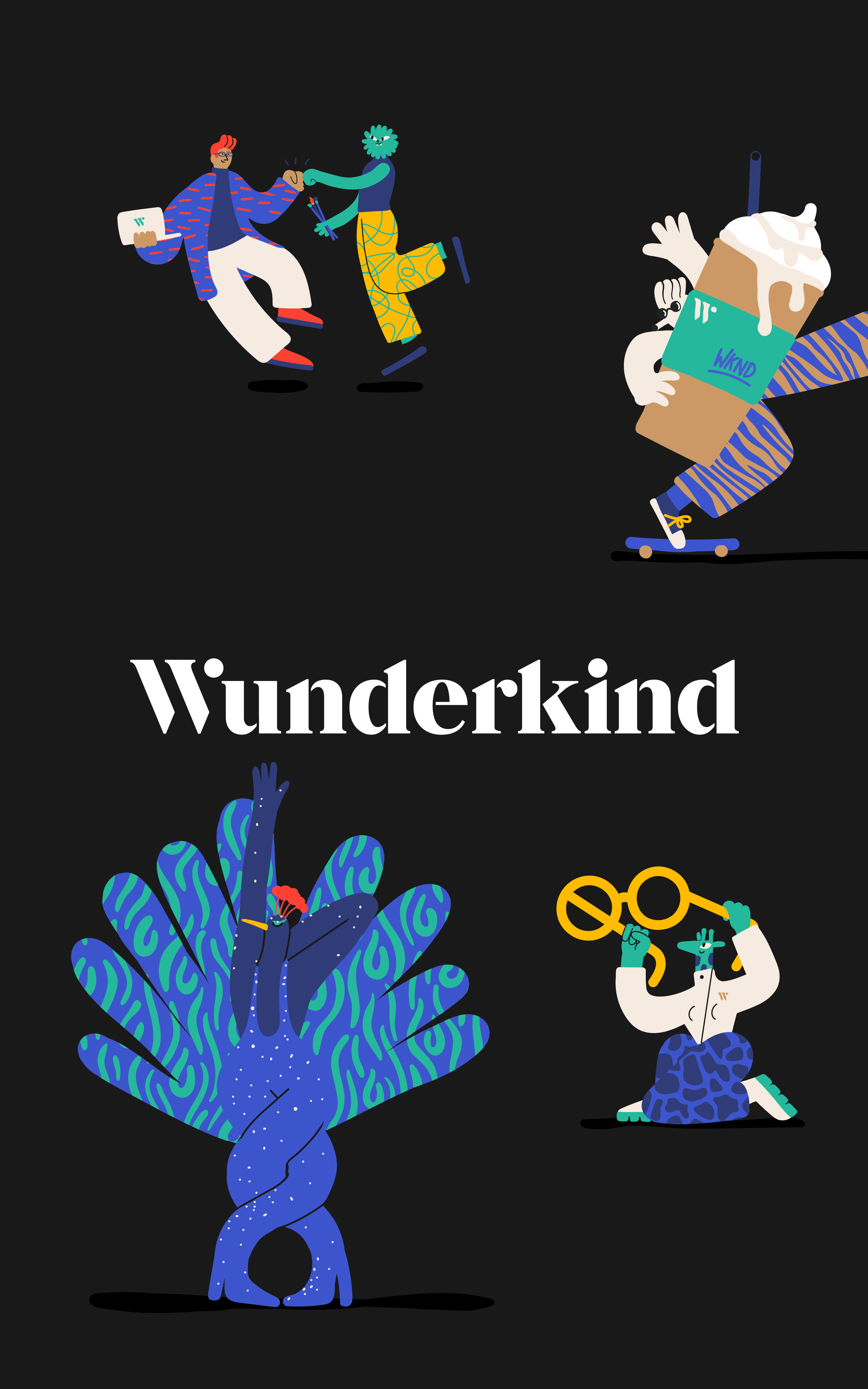
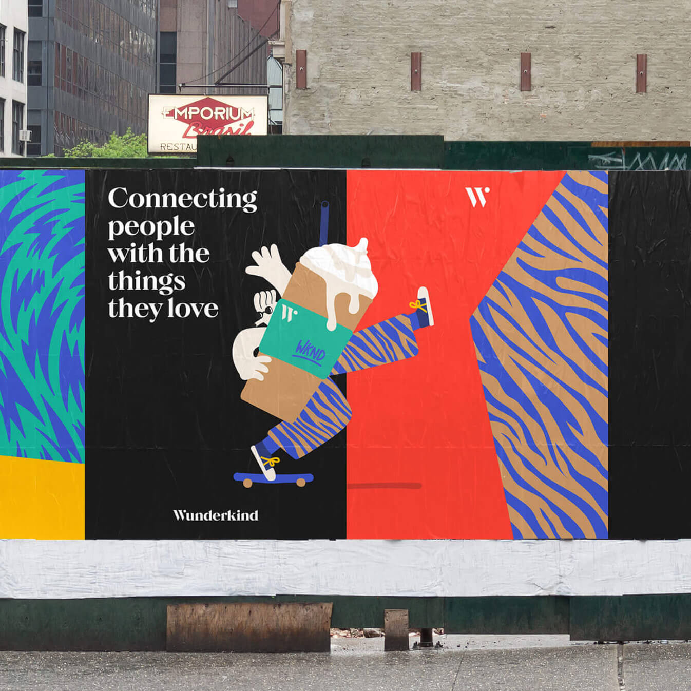
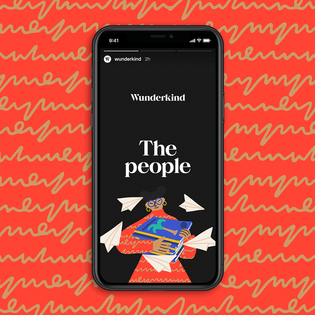
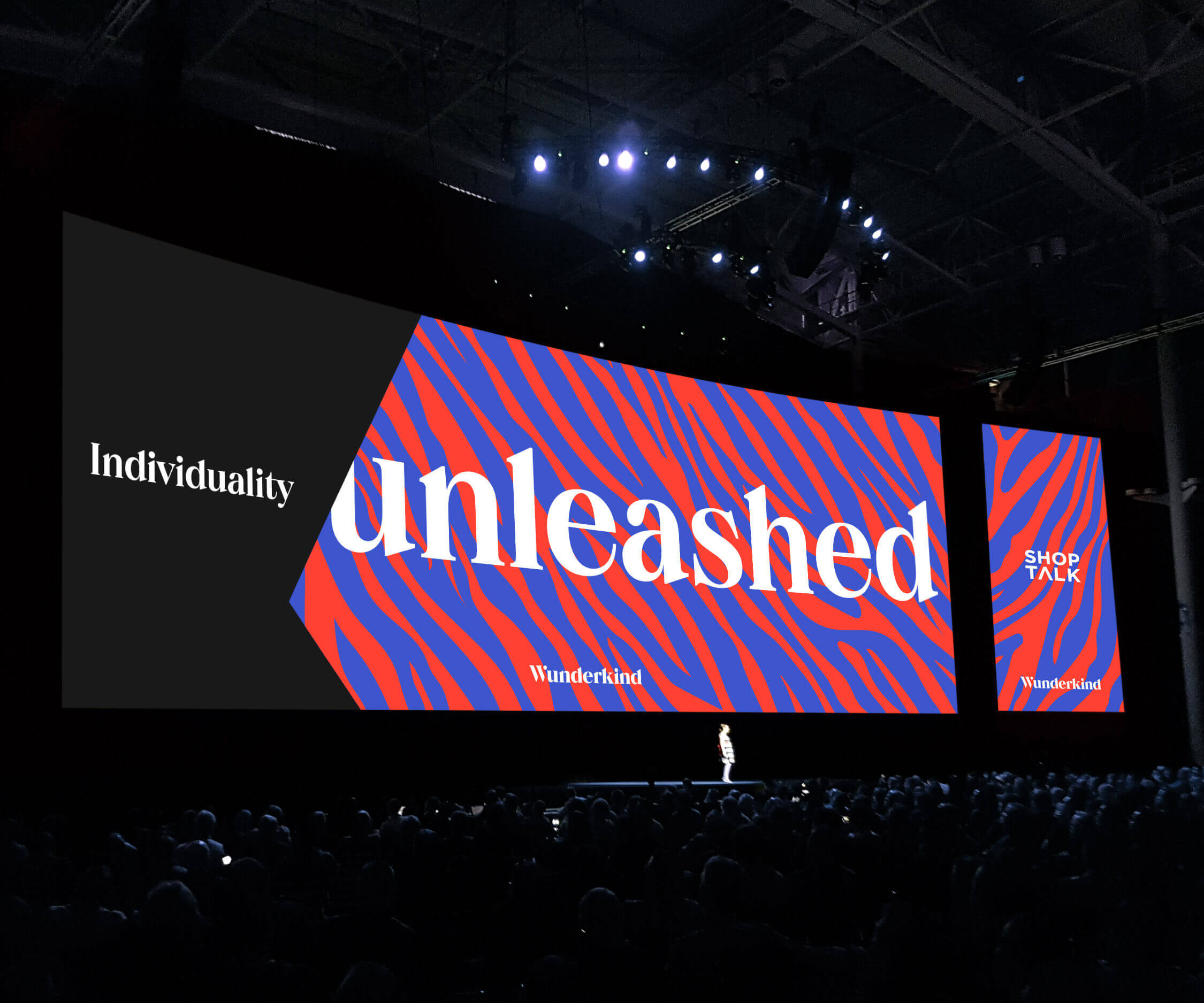
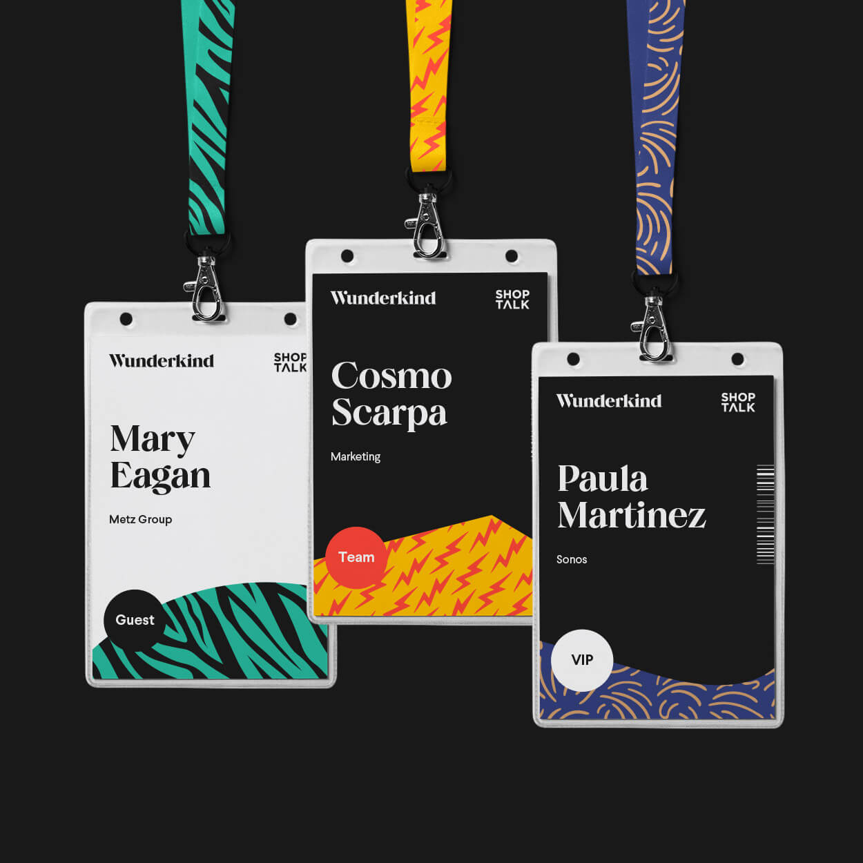
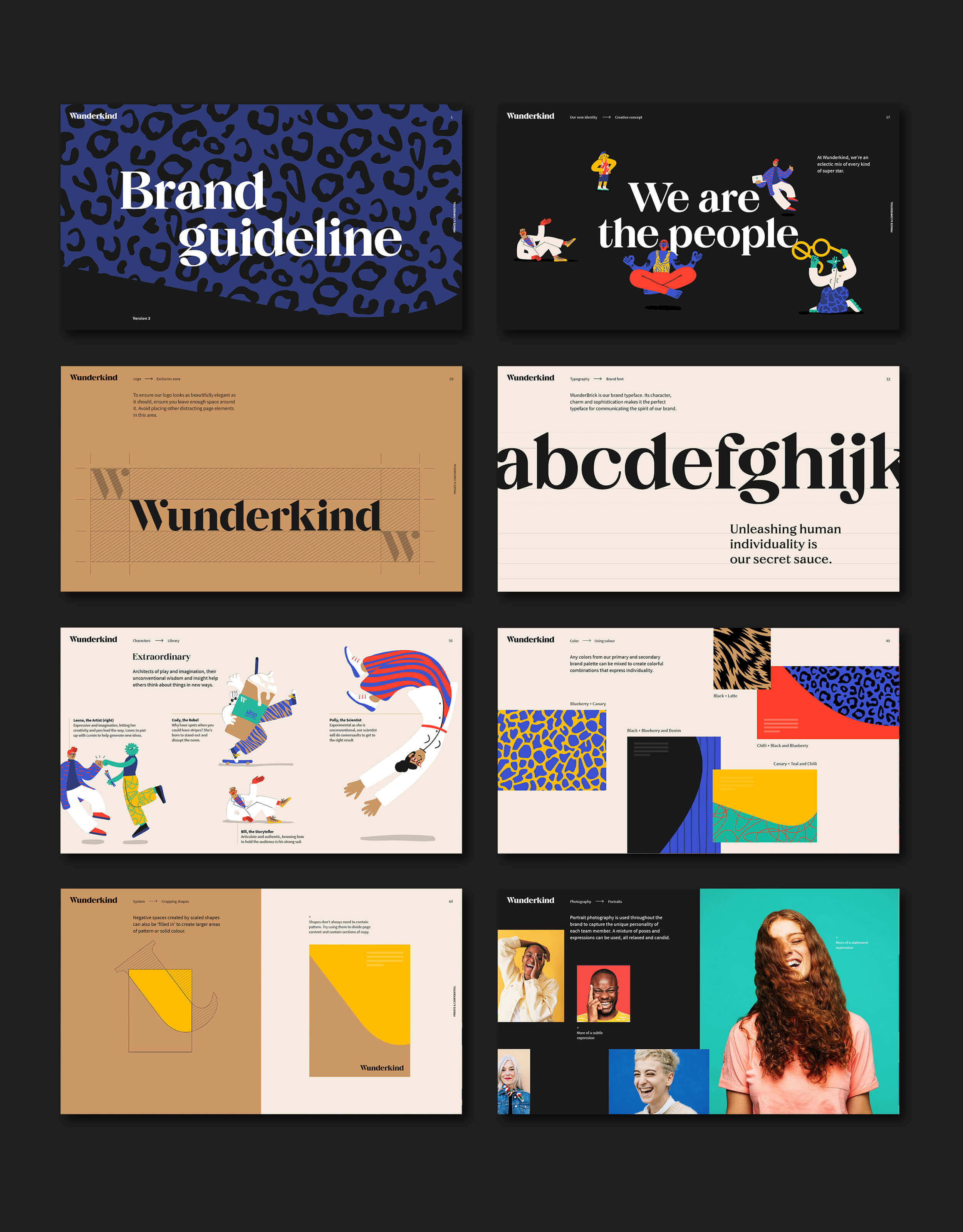
We translated the idea of individuality unleashed into a rich and flexible identity, built from a diverse and eclectic cast of characters, and the vivid and expressive graphic patterns on their clothes and skin.
In addition to their role as an adaptable, underlying design system for the brand, the characters and patterns are also used to communicate the company values, client benefits, and consumer behaviors that Wunderkind are able to see and connect with so effectively.


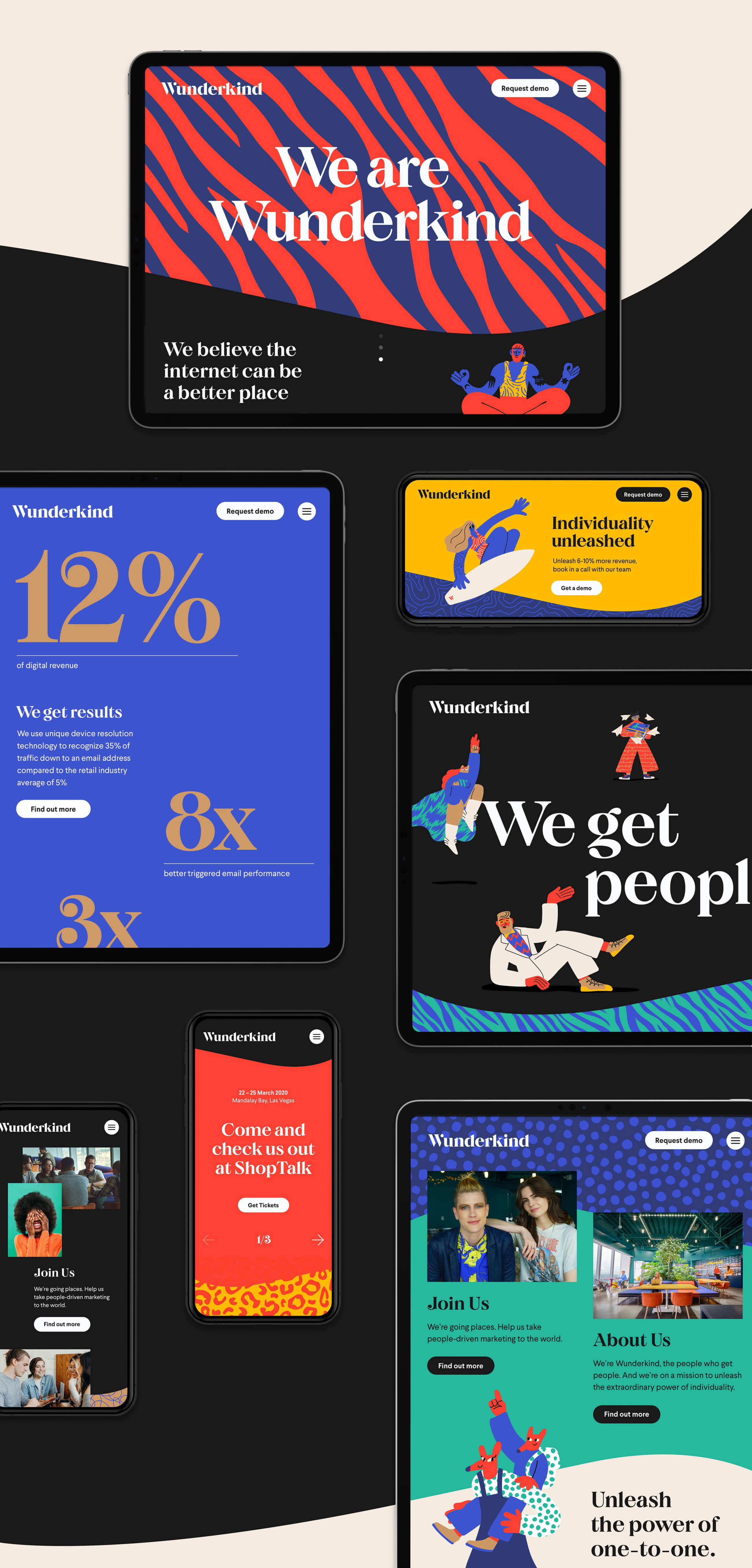
Digital-first impressions
Working closely with their in-house team, we gave the Wunderkind website a complete overhaul. From user experience, through to every message and motion behaviour, we brought the identity to life online.
Content design balances consistently clear explanations of their offer, with a compelling expression of their personality, for new and existing customers.
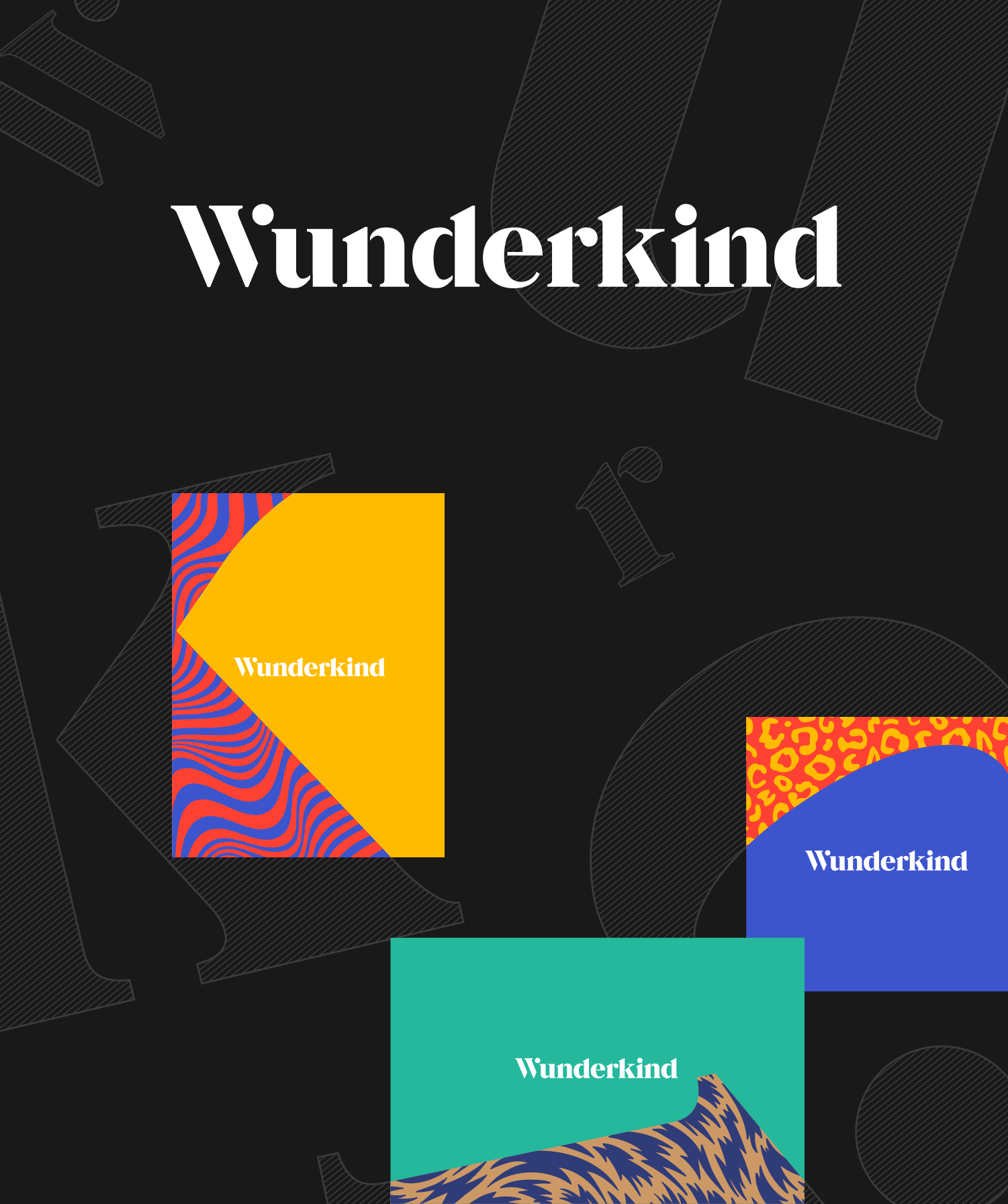
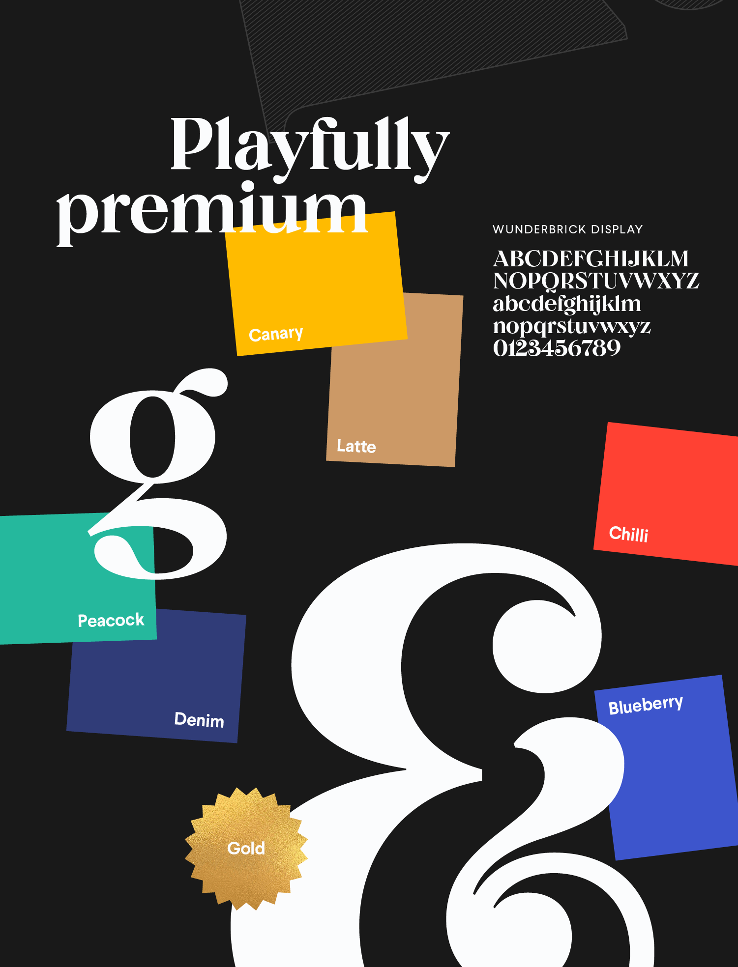
Playfully premium
The playful illustration style is balanced with a sophisticated new logo, and the striking use of black and white.
Separated, scaled and rotated, the deconstructed letterforms of the logo can be used to create shapes that can be filled with combinations of pattern and flat colours from the wider brand palette.
A customised version of type foundry Colophon’s sharp but quirky typeface, Brick, completes an overarching design language that feels fresh, fun and playful, but also premium and authoritative.
An adaptable system
With flexibility and longevity in mind, the identity has been designed to be easily recognisable and distinctively Wunderkind, with or without the characters playing a lead role.
So when pattern takes centre stage, the brand still exudes individuality, but the tone can be more sophisticated, and the message more single-minded.


Thank you
Special thanks to Kris, Christa, Ryan at Wunderkind, Barbora Idesová for the amazing illustrations, Michael Evamy for the copy, and Lumina NY for the site build.