Helping the world’s most ambitious content creators reach their full creative potential
With a billion hours watched every day, by almost a third of the internet’s daily users, YouTube has transformed media and entertainment by enabling the millions of creators behind their user-generated content to thrive.
For creators that have reached 10,000 or more subscribers on the platform, YouTube Space provides free and exclusive access to custom-built film studios and co-working spaces, state of the art equipment, industry experts, and global brands; via their seven permanent spaces around the world, touring pop-ups, and online services.


Brand challenge
The YouTube Space brand needed to drive a sense of excitement and aspiration amongst creators and brands alike — it needed to feel as creative on the outside as it is on the inside.
It also had to clearly differentiate from other YouTube communications, whilst creating a suitably strong association to capitalise on the credibility of the globally recognised master brand.
Lastly, it needed to be highly flexible and easy to use, to keep the high frequency of communications feeling fresh and varied, but consistent and recognisable.
MultiAdaptor was the missing link to defining and launching our brand identity. They fully immersed themselves in our world, delivering not only the creativity and imagination we needed, but a dedication to not stop until we got things just right.
Brand idea
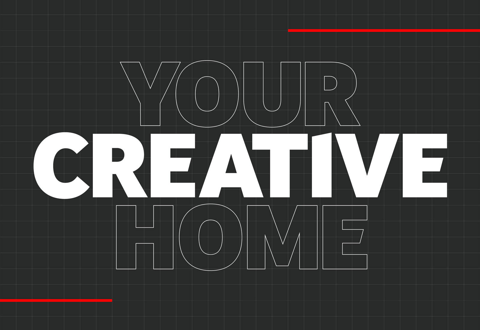
YouTube Space offers a home for the world’s most ambitious creators. With access to the world’s best facilities and expertise, in a nurturing environment, it provides the perfect conditions for creative growth. But it is the collective energy of its global membership that supercharges their progression.
This sense of ownership — of your creative home — mirrors the YouTube platform: it is defined by the people who create the content. It belongs to them. This is a brand that puts the people centre stage, with YouTube Space playing supporting role, bringing everything together.
Brand principles
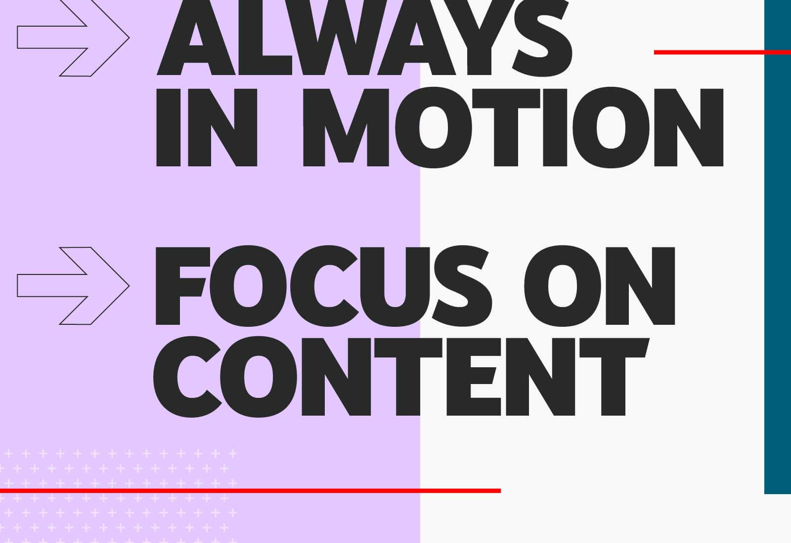
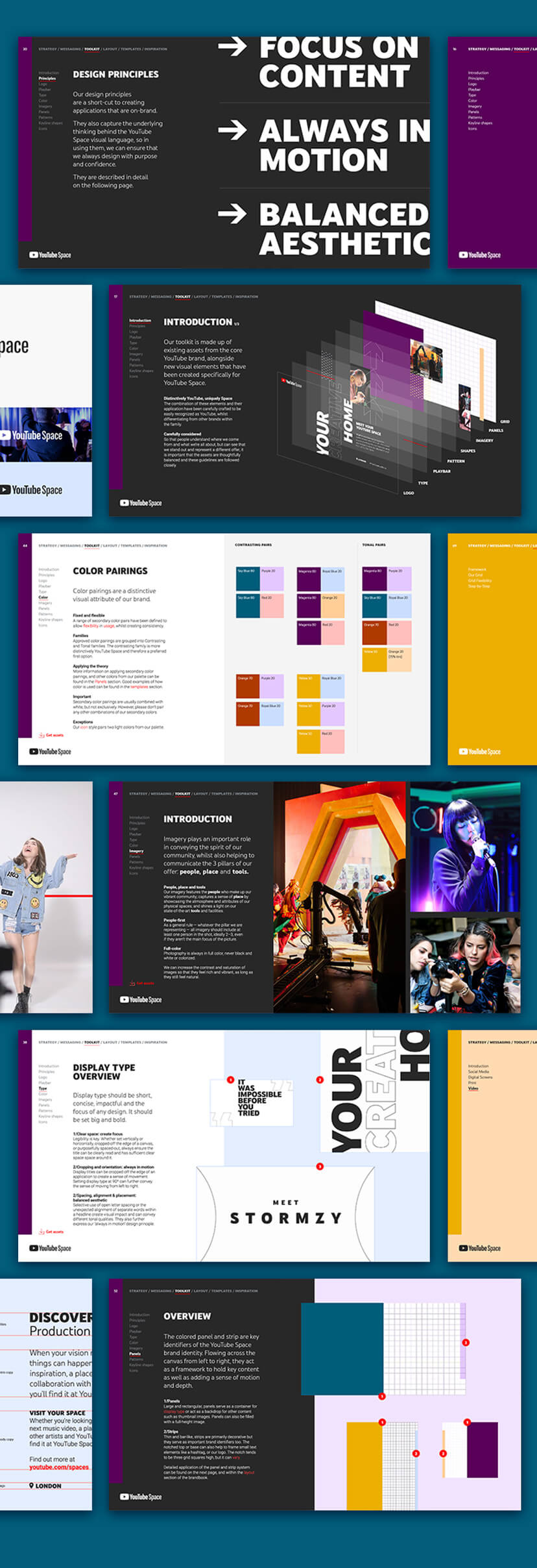
To drive a consistent, authentic, and engaging expression of the creative home idea, we designed a set of principles to help the brand reflect the infectious energy inside YouTube Space, whilst also putting the creators front and centre.
The result is a brand that feels like it is always in motion, even when applications are static — and rich with imagery of the creators in action and in-situ. With a focus on content, the brand elevates footage, photography, and functional copy, rather than crowding it with design elements.
Identity concept
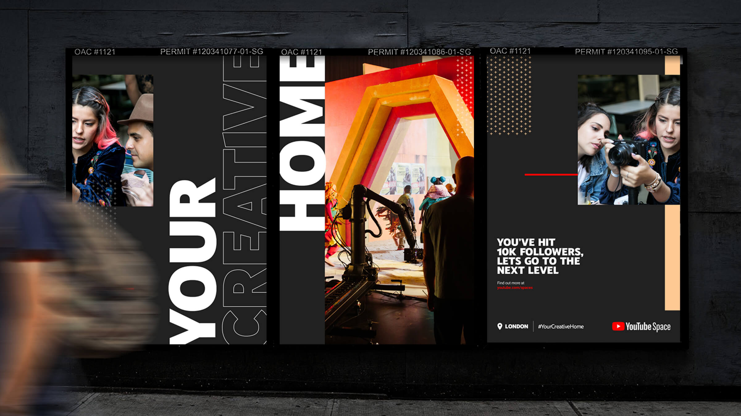
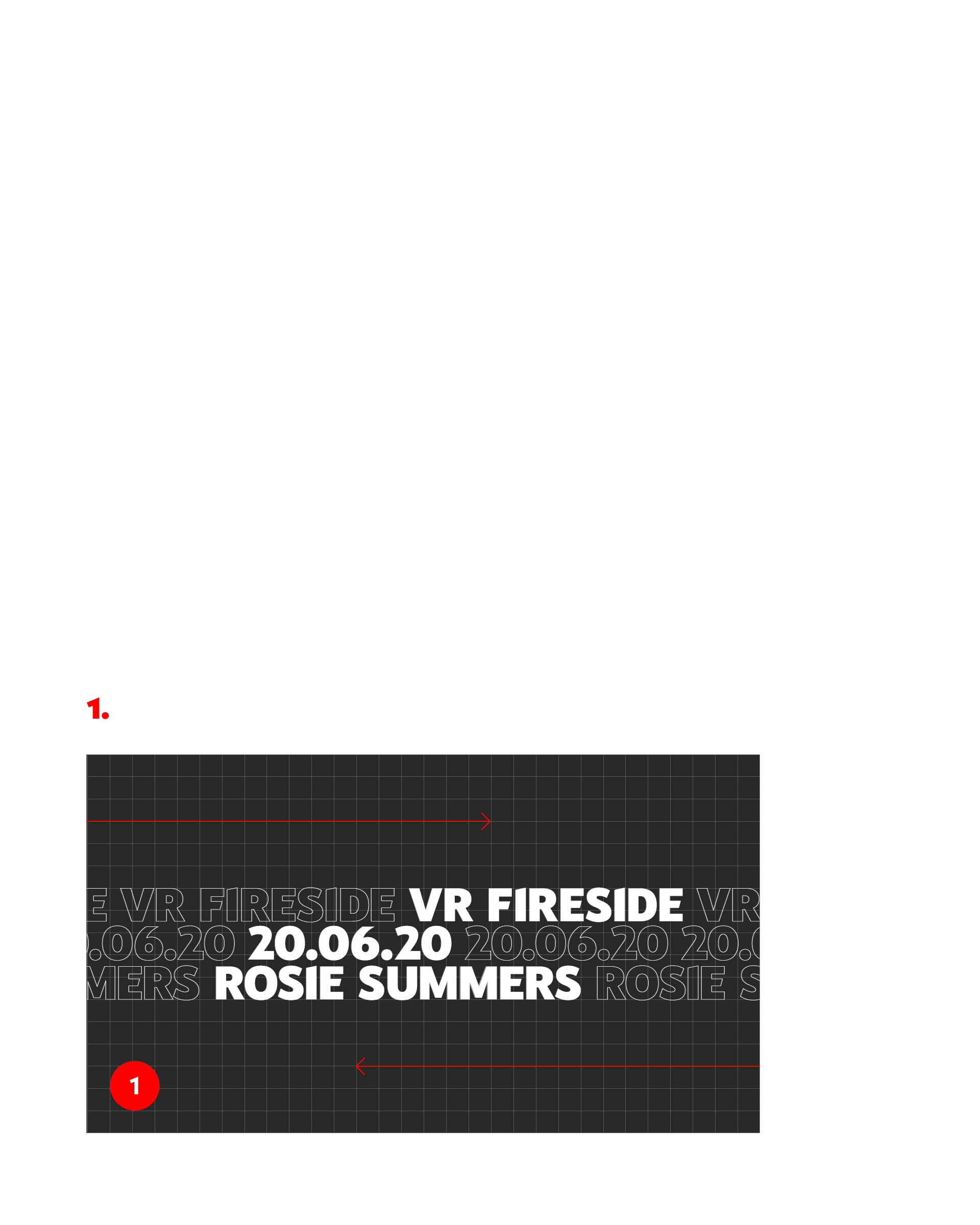
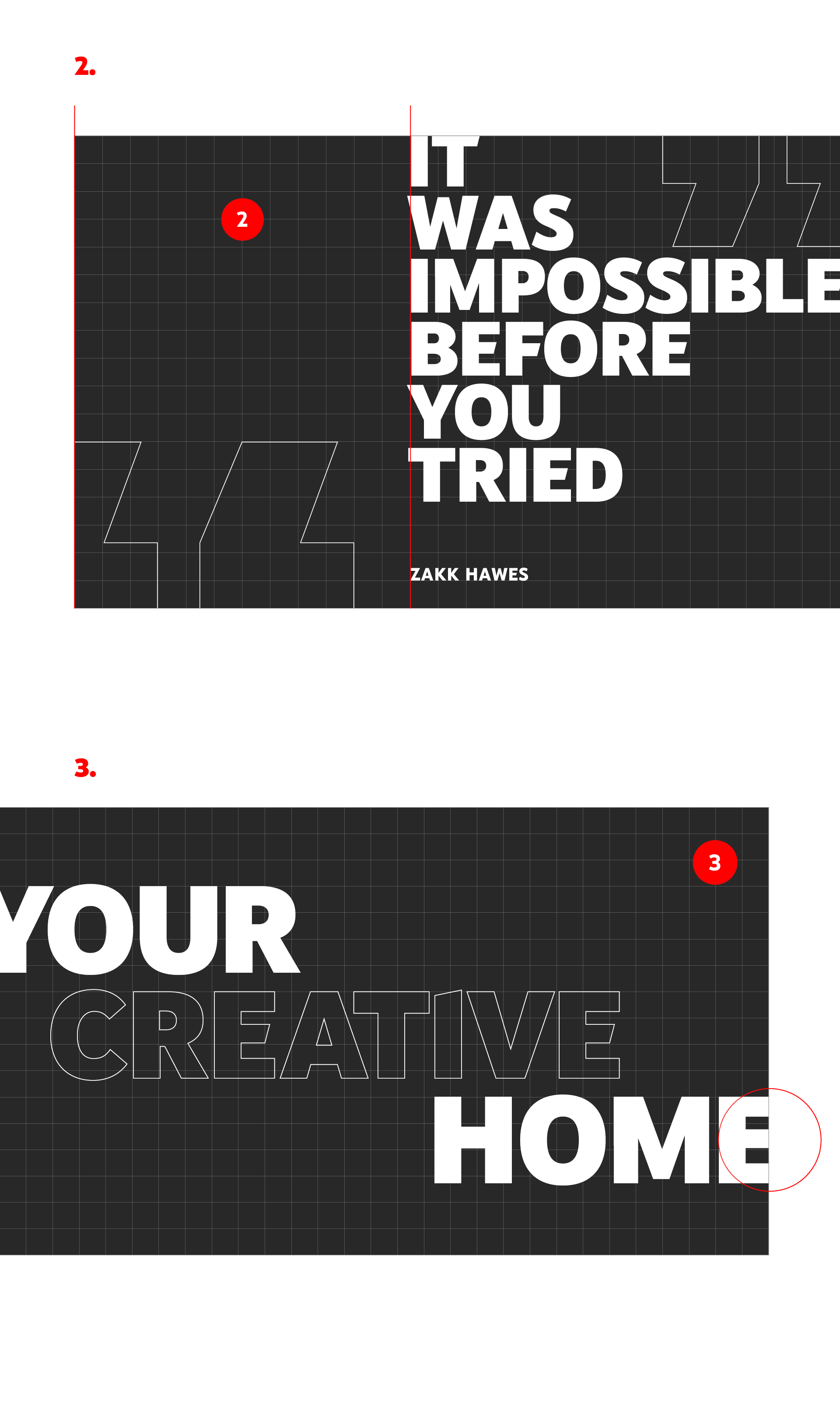
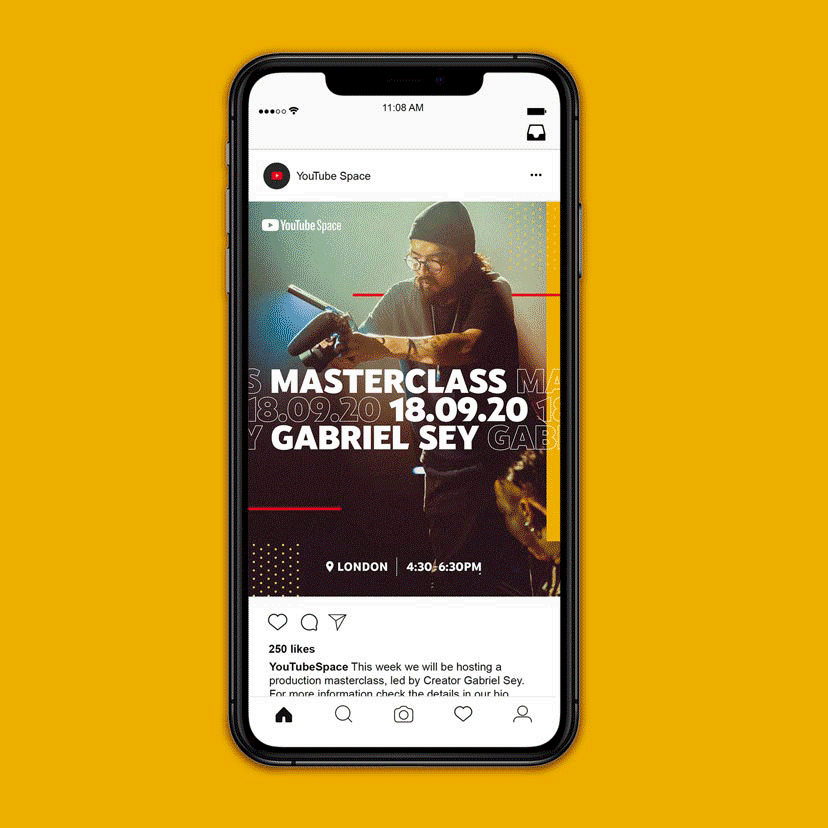
Our concept for the identity is inspired and built around the ever-present playbar — an iconic component of the YouTube experience, seen whenever we press play. Always moving from left to right, it conveys the idea of the rapid progression of the creators that YouTube Space supports.
Set free from its usual position at the bottom of a video player, the playbar weaves and flows through imagery and footage of everything that happens at YouTube Space. It creates a visual thread that forms the basis of a motion-first, content-led design system that feels alive and varied, but distinctly YouTube.
Typography
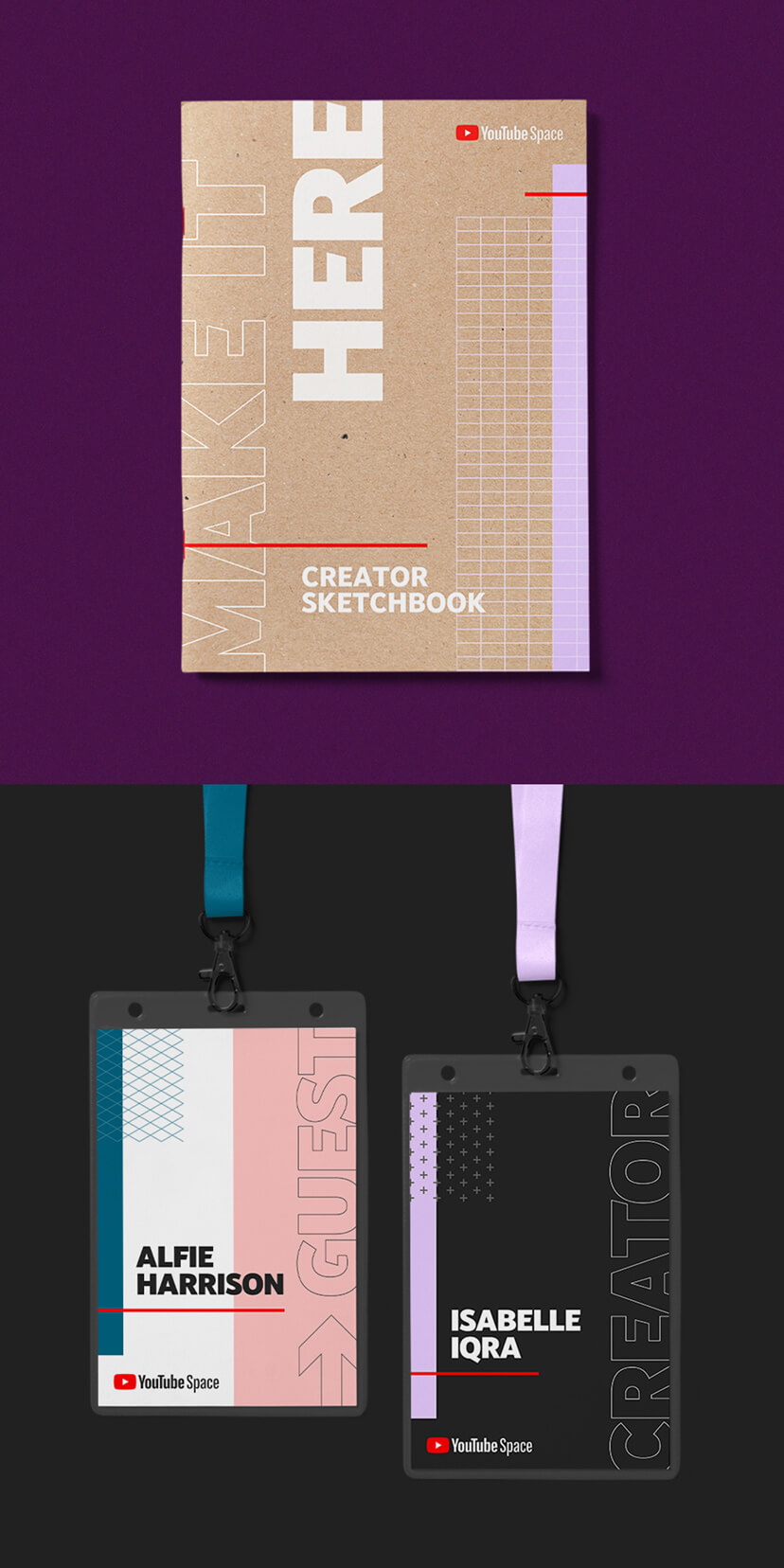
Leading with the heaviest weight of YouTube’s proprietary font, YouTube Sans, and set in a combination of filled and outlined capitalised characters, we developed a bold, expressive typographic style, underpinned by a rigorous system.
The result is a consistently recognisable but highly flexible aesthetic, that conveys the unique sense of energy and excitement of the YouTube Space experience, whilst closely aligning with YouTube’s core brand.
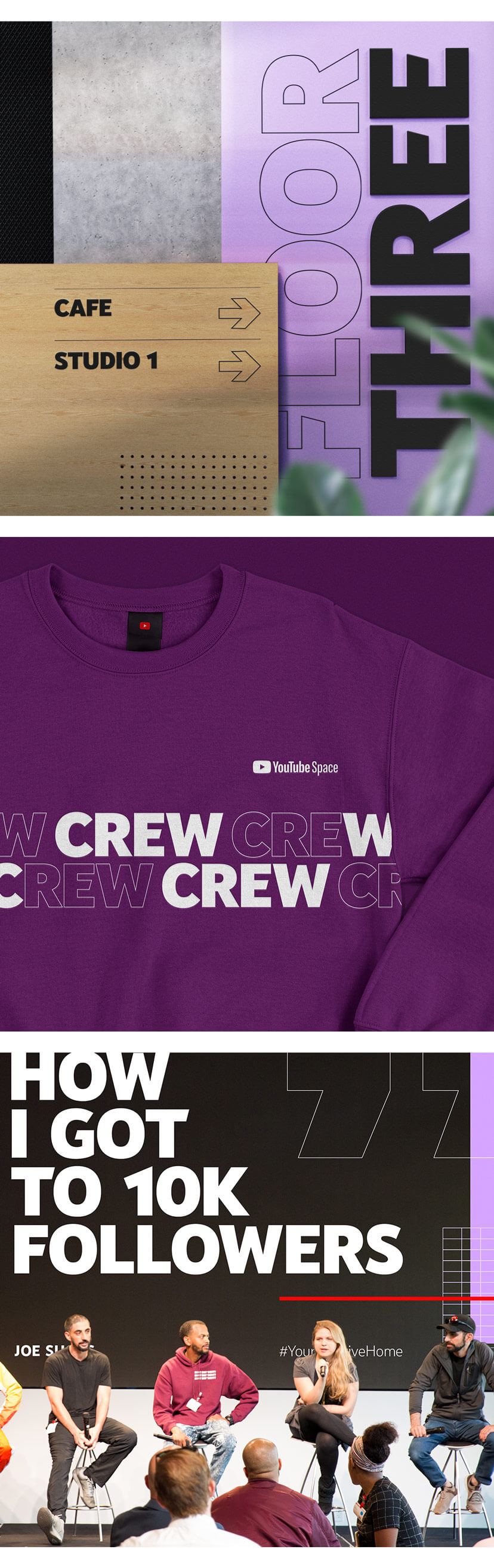
Photography and footage
Imagery and video is core to the brand. The design system is geared around our ‘content first’ principle to put the creators front and centre, but also powerfully convey what YouTube Space gives them access to.
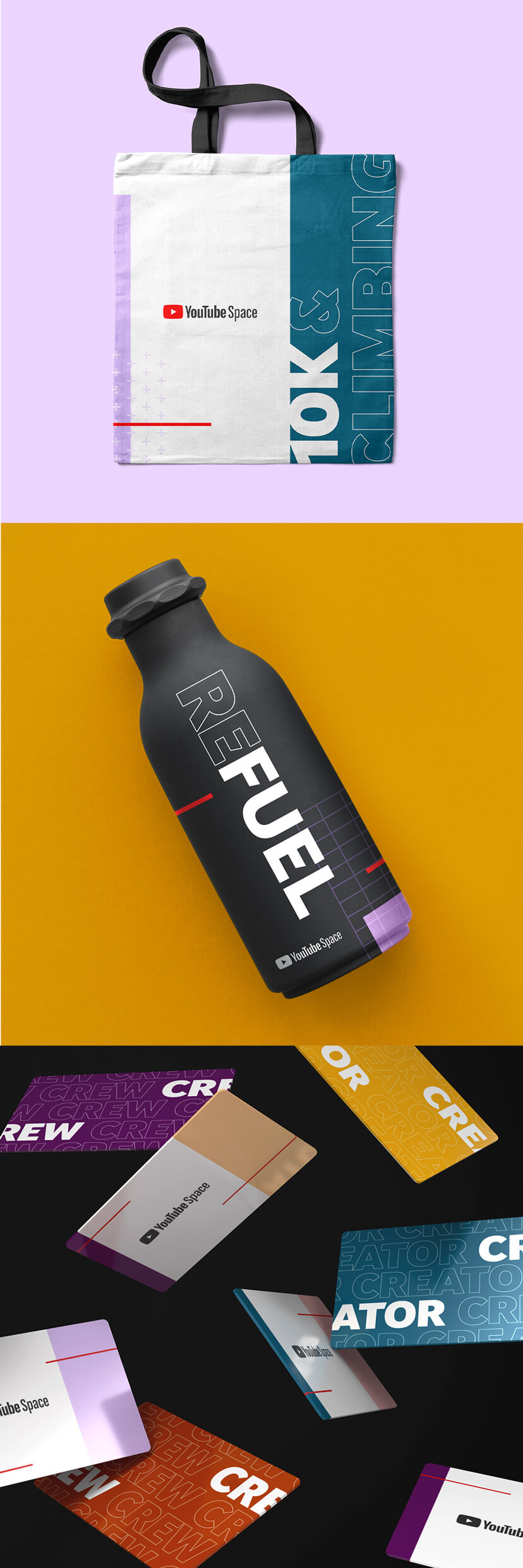
To help them organise and navigate their vast image libraries, and direct new shoots, we built a framework around the three pillars of the YouTube Space offer: people, place, and tools. By showing creators in the context of YouTube’s exclusive film studios, production suites and co-working spaces, and collaborating with industry experts and state of the art equipment, photography and footage puts the experience of members at the heart of the brand.


Colour
We purposefully grounded the YouTube Space colour palette in the core brand’s iconic red, white, and black. Pairing these with carefully selected combinations from the broader, predefined master palette creates a look that is recognisably YouTube, but uniquely YouTube Space.
Picked for their warmth and sophistication, the secondary colours aim to give YouTube Space a premium and aspirational feel, whilst maintaining YouTube’s playful and inclusive character traits.
Coming to Life
From the fullest expressions, to the most functional, we considered every touch point of the YouTube Space brand. It’s a system that has been designed with usability and longevity in mind: easy for marketing teams to adopt and adapt, globally. Always in motion, and with a focus on content and context, it’s a principle-driven flexible identity that’s fit for purpose.
Thank you
Special thanks to Taylor, Sophie, and Jess at YouTube Space for the incredible collaboration and making the project possible.